Did you know the internet is now over 30 years old? The very first website was launched by World Wide Web creator Tim Berners-Lee on 6 August 1991 — and it’s still available to view today!
Web design has evolved dramatically since those early days. We’ve moved from basic layouts and minimal fonts to sophisticated, high-performing websites packed with dynamic features, optimised for SEO, PPC, and user experience (UX).
At SoNick Marketing, we specialise in web design for tradespeople, salons, solicitors, and local businesses that rely on consistent local lead generation. Whether you’re a plumber, a solicitor, or a beauty salon owner, having an effective, modern website is no longer optional — it’s essential.
Here’s what you need to know to create a winning website in 2025.
What Does Great Web Design Really Mean?
When people hear “web design”, they often think only about looks. But strong web design goes far deeper. It’s not just about eye-catching layouts — it’s about how your site is structured, how easily users navigate, and how effectively your brand, SEO, and calls to action (CTAs) are woven throughout every page.
Great websites bring design, brand consistency, lead generation, and SEO together into one seamless experience.
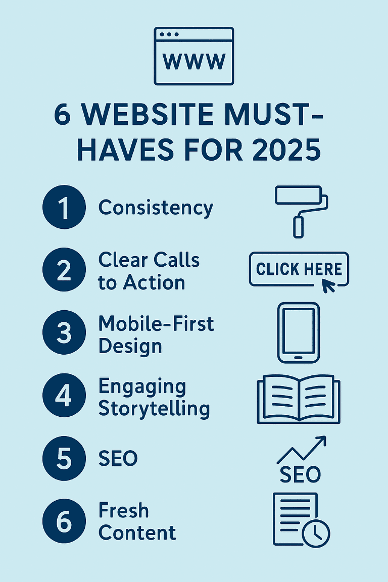
6 Essential Web Design Best Practices for 2025
1. Consistency Across Visuals and Functionality
Gone are the days of chaotic websites with flashing graphics and autoplay music.
Today, consistency is king:
- Use a unified colour palette, typography, and button styles across all pages.
- Keep navigation, headers, footers, and call-to-action (CTA) placements predictable.
- Ensure functional consistency too — users should intuitively know how to move through your site.
Why it matters: A consistent website builds trust, improves user experience (UX), and keeps visitors engaged longer — crucial for local lead generation and SEO performance.
👉 Need a polished, professional site? Explore our website design services.
2. Clear and Frequent Calls to Action (CTAs)
Visitors won’t take action unless you tell them what to do. Strong CTAs are essential.
Tips for effective CTAs:
- Use action-driven language like Get a Free Quote, Book Your Consultation, or Call Now.
- Place CTAs strategically throughout your site (not just on the homepage).
- Use clickable buttons to increase click-through rates.
Strong CTAs are vital for SEO, PPC landing pages, and conversion-focused websites.
✅ Bonus Tip: For combined strategies, check out our SEO and PPC packages.
3. Mobile-First Design: A Must in 2025
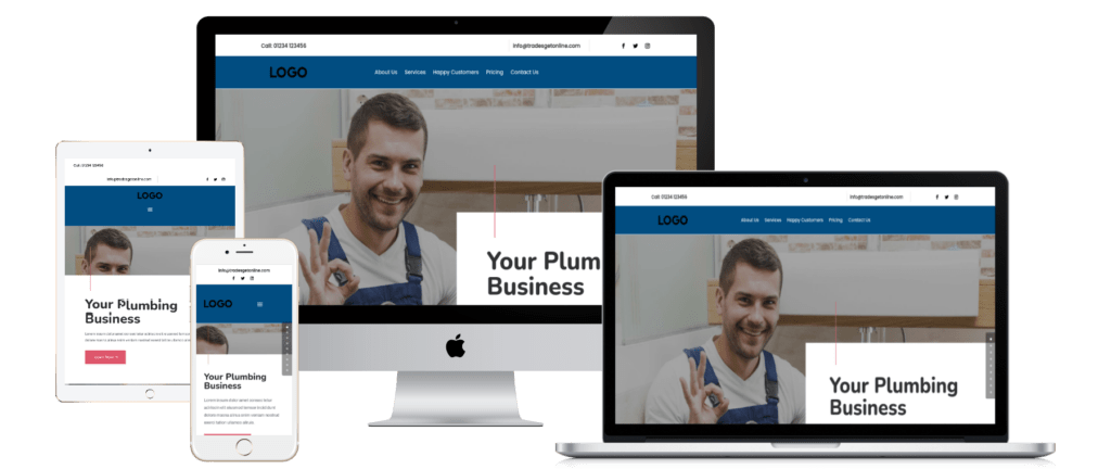
In 2025, over 65% of web traffic happens on mobile devices — and Google’s mobile-first indexing means mobile usability directly impacts your search rankings.
What mobile-first means for your website:
- Responsive layouts that adjust perfectly to smartphones and tablets.
- Fast loading times (ideally under 3 seconds).
- Easy-to-tap buttons and streamlined navigation.
A site that isn’t mobile-optimised will not only lose you leads but could bury you in search results.
👉 Need inspiration? See our website design for plumbers — fully mobile-optimised for local lead generation!
4. Engaging Storytelling with Copy and Design
Design without compelling content is just decoration.
To truly connect with your visitors, your website must tell your brand story — in both visuals and words.
How to master storytelling:
- Share your brand values and mission clearly.
- Use case studies, testimonials, and local success stories.
- Ensure every headline, paragraph, and CTA ties back to your users’ goals.
💡 Pro Tip: Investing in website copywriting services ensures your message is not only engaging but SEO-optimised too.
5. SEO Built into Your Web Design

Building SEO into your website from day one is far more effective than trying to “retrofit” it later.
Key SEO elements to integrate early:
- Keyword-rich headings (H1, H2, H3 structure).
- Fast page speed (compress images, optimise code).
- Logical navigation and internal linking.
- Mobile-first responsive design.
- Meta descriptions and image alt text.
A technically sound, content-rich website will rank higher, generate more organic traffic, and convert better.
👉 Learn more about how we help with SEO agency services and free SEO audits.
6. Keep Content Fresh and Up-to-Date
Regularly updating your site with:
- Blog posts (see our marketing blog),
- New services,
- Case studies,
- Local news stories…
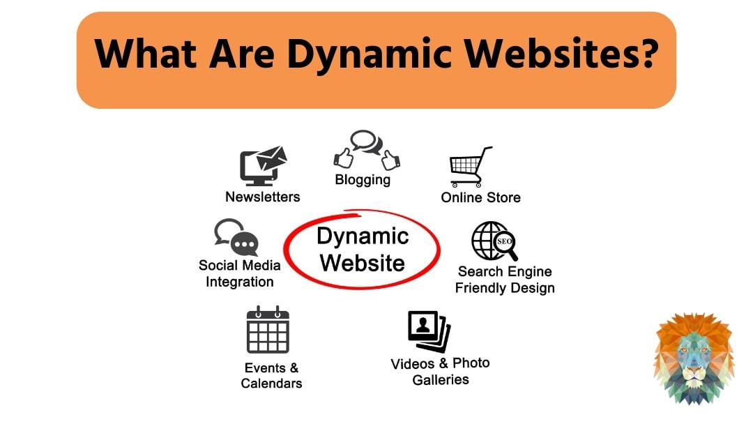
…keeps your website dynamic and improves your SEO rankings in 2025 and beyond.
Google loves fresh content — and so do your visitors.
If you need help building an ongoing strategy, our content marketing services can help.
Why Good Website Design is Your Best Investment
For small businesses like tradespeople, salons, and solicitors, a modern, lead-generating website is your 24/7 salesperson.
A site that is:
- Well-designed,
- SEO-optimised,
- Built to convert…
…will generate more local leads, improve brand credibility, and deliver a higher ROI on your marketing efforts.
At SoNick Marketing, we design websites that don’t just look great — they drive results. Whether you need help with SEO for plumbers, legal SEO, or a custom WordPress maintenance package, we’re here to support your growth.
Ready to Build a Website That Works?
If you’re serious about growing your local business with a website that delivers real leads — not just page views — let’s chat.
At SoNick Marketing, we offer bespoke website design, local SEO, Google Ads management and PPC services tailored to your industry.
📞 Contact us today to book your free consultation and let’s build a site that fuels your growth in 2025 and beyond!



0 Comments